Thursday, September 22, 2011

The sampling theorem explained with numpy

The sampling theorem states that a continuous signal x(t) bandlimited to B Hz can be recovered from its samples x[n] = x(n*T), where n is an integer, if T is greater than or equal to 1/(2B) without loss of any information. And we call 2B the Nyquist rate.
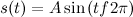
Sampling at a rate below the Nyquist rate is called undersampling, it leads to the aliasing effect. Let's observe the aliasing effect with the following script:
from numpy import linspace,cos,pi,ceil,floor,arange
from pylab import plot,show,axis

# sampling a signal badlimited to 40 Hz 
# with a sampling rate of 800 Hz
f = 40;  # Hz
tmin = -0.3;
tmax = 0.3;
t = linspace(tmin, tmax, 400);
x = cos(2*pi*t) + cos(2*pi*f*t); # signal sampling
plot(t, x)

# sampling the signal with a sampling rate of 80 Hz
# in this case, we are using the Nyquist rate.
T = 1/80.0;
nmin = ceil(tmin / T);
nmax = floor(tmax / T);
n = arange(nmin,nmax);
x1 = cos(2*pi*n*T) + cos(2*pi*f*n*T);
plot(n*T, x1, 'bo')

# sampling the signal with a sampling rate of 35 Hz
# note that 35 Hz is under the Nyquist rate.
T = 1/35.0;
nmin = ceil(tmin / T);
nmax = floor(tmax / T);
n = arange(nmin,nmax);
x2 = cos(2*pi*n*T) + cos(2*pi*f*n*T);
plot(n*T, x2, '-r.',markersize=8)

axis([-0.3, 0.3, -1.5, 2.3])
show()
The following figure is the result:
The blue curve is the original signal, the blue dots are the samples obtained with the Nyquist rate and the red dots are the samples obtainde with 35 Hz. It's easy to see that the blue samples are enough to recover the blue curve, while the red ones are not enough to capture the oscillations of the signal.

Wednesday, September 14, 2011

Uncertainty principle and spectrogram with pylab

The Fourier transform does not give any information on the time at which a frequency component occurs. One approach which can give information on the time resolution of the spectrum is the Short Time Fourier Transform (STFT). Here a moving window is applied to the signal and the Fourier transform is applied to the signal within the window as the window is moved [Ref]. The choice of window is very important with respect to the performance of the STFT in practice. Since the STFT is simply applying the Fourier transform to pieces of the time series of interest, a drawback of the STFT is that it will not be able to resolve events if they happen to appear within the width of the window. In this case, the lack of time resolution of the Fourier transform is present. In general, one cannot achieve simultaneous time and frequency resolution because of the Heisenberg uncertain principle. In the field of particle physics, an elementary particle does not have precise position and momentum. The better one determines the position of the particle, the less precisely is know at that time, and vice versa. For signal processing, this rule translates into the fact that a signal does not simultaneously have a precise location in time and precise frequency [Ref].

The library pylab provides the function specgram(...) to compute the spectrogram of a signal using the STFT. The following script uses that function to show the spectrogram of a signal with different windows size:
from scipy.io.wavfile import read,write
from pylab import plot,show,subplot,specgram

# Open the Homer Simpson voice: "Ummm, Crumbled up cookie things."
# from http://www.thesoundarchive.com/simpsons/homer/mcrumble.wav
rate,data = read('mcrumble.wav') # reading

subplot(411)
plot(range(len(data)),data)
subplot(412)
# NFFT is the number of data points used in each block for the FFT
# and noverlap is the number of points of overlap between blocks
specgram(data, NFFT=128, noverlap=0) # small window
subplot(413)
specgram(data, NFFT=512, noverlap=0) 
subplot(414)
specgram(data, NFFT=1024, noverlap=0) # big window

show()
This image is the result:
The pictures shows that changing the number of data points used for each Fourier transform block, the spectrogram loses definition in frequency or in the time.

Thursday, September 8, 2011

Sound Synthesis

Physically, sound is an oscillation of a mechanical medium that makes the surrounding air also oscillate and transport the sound as a compression wave. Mathematically, the oscillations can be described as
where t is the time, and f the frequency of the oscillation. Sound on a computer is a sequence of numbers and in this post we will see how to generate a musical tone with numpy and how to write it to a file wav file. Each musical note vibrates at a particular frequency and the following script contains a function to generate a note (tone(...)), we'll use this function to generate the A tone creating an oscillation with f = 440 Hz.
from scipy.io.wavfile import write
from numpy import linspace,sin,pi,int16
from pylab import plot,show,axis

# tone synthesis
def note(freq, len, amp=1, rate=44100):
 t = linspace(0,len,len*rate)
 data = sin(2*pi*freq*t)*amp
 return data.astype(int16) # two byte integers

# A tone, 2 seconds, 44100 samples per second
tone = note(440,2,amp=10000)

write('440hzAtone.wav',44100,tone) # writing the sound to a file

plot(linspace(0,2,2*44100),tone)
axis([0,0.4,15000,-15000])
show()
Now we can play the file 440hzAtone.wav with an external player. This plot shows a part of the signal generated by the script:
And using the plotSpectrum function defined in a previous post we can verify that 440 Hz is the fundamental frequency of the tone.

Friday, September 2, 2011

Eigenvectors animated gif

We have already seen how to make an animation using pylab. In this post we will use a trick proposed here by Alemi to make another animation. The animation we are going to see shows the eigenvectors of a matrix A 2-by-2 and the result of the linear application A*v when v is a vector that lies on the unit circle. Each frame of the animation is generated by the following script:
from pylab import arrow,axis,clf,savefig,plot
from numpy import array,pi,cos,sin,dot
from numpy.linalg import eig

theta = pi/9
R = array([ [cos(theta), -sin(theta)],  # rotation matrix
            [sin(theta), cos(theta)] ])
v = array([0,1]) # y axis versor

A = array([ [3, -1],  # transformation matrix
            [0,  2] ])
eival,eivec = eig(A) # eigen values and eigenvectors

for i in range(18):
 v = dot(R,v) # theta radiants rotation of v
 y = dot(A,v) # transformation
 # current original vector
 arrow(0,0,v[0],v[1], width=0.01, color='b')
 # current resulting vector
 arrow(0,0,y[0],y[1], width=0.01, color='g') 
 # ellipse axis
 arrow(0,0,eival[0]*eivec[0,0],eival[0]*eivec[1,0], width=0.01, color='y') # major
 arrow(0,0,eival[1]*eivec[0,1],eival[1]*eivec[1,1], width=0.01, color='y') # minor
 # 1st eigenvector
 arrow(0,0,eivec[0,0],eivec[1,0], width=0.01, color='r')
 # 2nd eigenvector
 arrow(0,0,eivec[0,1],eivec[1,1], width=0.01, color='r')
 axis([-3.5,3.5,-3.5,3.5])
 savefig('rotation/'+'0'+str(i+1)+'.png') # save the frame
 clf() # figure clear
And the animated gif is created using the command convert in the directory where the frames have been saved:
$ cd rotation
$ convert *.png -delay 50 -layers Optimize anim.gif
The command is provided by the ImageMagick suite available under linux. Click on the following image to see the animation.
The vector v is represented by the blue arrow, A*v is the green arrow, the eigenvectors are the red arrows, and the yellow arrows are the eigenvectors multiplied by the their respective eigenvalues.