We can represent a shape with a matrix like the following:

where each pair (xi,yi) is a "landmark" point of the shape and we can transform every generic point (x,y) using this function:
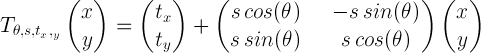
In this transformation we have that θ is a rotation angle, tx and ty are the translation along the x and the y axis respectively, while s is a scaling coefficient. Applying this transformation to every point of the shape described by X we get a new shape which is a transformation of the original one according to the parameters used in T. Given a matrix as defined above, the following Python function is able to apply the transformation to every point of the shape represented by the matrix:
import numpy as np
import pylab as pl
from scipy.optimize import fmin

def transform(X,theta,tx=0,ty=0,s=1):
 """ Performs scaling, rotation and translation
     on the set of points in the matrix X

    Input:
      X, points (each row have to be a point [x, y])
      theta, rotation angle (in radiants)
      tx, translation along x
      ty, translation along y
      s, scaling coefficient
    Return:
      Y, transformed set of points
 """
 a = math.cos(theta)
 b = math.sin(theta)
 R = np.mat([[a*s, -b*s], [b*s, a*s]])
 Y = R*X # rotation and scaling
 Y[0,:] = Y[0,:]+tx # translation
 Y[1,:] = Y[1,:]+ty
 return Y
Now, we want to find the best pose (translation, scale and rotation) to match a model shape X to a target shape Y.
We can solve this problem minimizing the sum of square distances between the points of X and the ones of Y, which means that we want to find
where T' is a function that applies T to all the point of the input shape. This task turns out to be pretty easy using the fmin function provided by Scipy:
def error_fun(p,X,Y):
 """ cost function to minimize """
 return np.linalg.norm(transform(X,p[0],p[1],p[2],p[3])-Y)

def match(X,Y,p0):
 """ Match the model X with the shape Y
     returns the set of parameters to transform
     X into Y and a set of partial solutions.
 """
 p_opt = fmin(error_fun, p0, args=(X,Y),retall=True)
 return p_opt[0],p_opt[1] # optimal solutions, other solutions
In the code above we have defined a cost function which measures how close the two shapes are and another function that minimizes the difference between the two shapes and returns the transfomation parameters.
Now, we can try to match the trifoil shape starting from one of its transformations using the functions defined above:
# generating a shape to match
t = np.linspace(0,2*np.pi,50)
x = 2*np.cos(t)-.5*np.cos( 4*t )
y = 2*np.sin(t)-.5*np.sin( 4*t )
A = np.array([x,y]) # model shape
# transformation parameters
p = [-np.pi/2,.5,.8,1.5] # theta,tx,ty,s
Ar = transform(A,p[0],p[1],p[2],p[3]) # target shape
p0 = np.random.rand(4) # random starting parameters
p_opt, allsol = match(A,Ar,p0) # matching
It's interesting to visualize the error at each iteration:
pl.plot([error_fun(s,A,Ar) for s in allsol])
pl.show()

and the value of the parameters of the transformation at each iteration:
pl.plot(allsol)
pl.show()

From the graphs above we can observe that the the minimization process found its solution after 150 iterations. Indeed, after 150 iterations the error become very close to zero and there is almost no variation in the parameters. Now we can visualize the minimization process plotting some of the solutions in order to compare them with the target shape:
def plot_transform(A,p):
 Afound = transform(A,p[0],p[1],p[2],p[3])
 pl.plot(Afound[0,:].T,Afound[1,:].T,'-')

for k,i in enumerate(range(0,len(allsol),len(allsol)/15)):
 pl.subplot(4,4,k+1)
 pl.plot(Ar[0,:].T,Ar[1,:].T,'--',linewidth=2) # target shape
 plot_transform(A,allsol[i])
 pl.axis('equal')
pl.show()

In the graph above we can see that the initial solutions (the green ones) are very different from the shape we are trying to match (the dashed blue ones) and that during the process of minimization they get closer to the target shape until they fits it completely. In the example above we used two shapes of the same form. Let's see what happen when we have a starting shape that has a different form from the target model:
t = np.linspace(0,2*np.pi,50)
x = np.cos(t)
y = np.sin(t)
Ac = np.array([x,y]) # the circle (model shape)
p0 = np.random.rand(4) # random starting parameters
# the target shape is the trifoil again
p_opt, allsol = match(Ac,Ar,p0) # matching
In the example above we used a circle as model shape and a trifoil as target shape. Let's see what happened during the minimization process:
for k,i in enumerate(range(0,len(allsol),len(allsol)/15)):
 pl.subplot(4,4,k+1)
 pl.plot(Ar[0,:].T,Ar[1,:].T,'--',linewidth=2) # target shape
 plot_transform(Ac,allsol[i])
 pl.axis('equal')
pl.show()

In this case, where the model shape can't match the target shape completely, we see that the minimization process is able to find the circle that is closer to the trifoil.